Streamlining the Checkout Experience at ZO
Driving a 17% revenue increase by reducing transaction friction and simplifying the path to purchase.

Problem
In late 2023, ZO Skin Health migrated from Shopify to Salesforce to support backend scaling. Immediately following the move, we saw a significant drop in revenue.
Because our marketing efforts and brand identity remained the same, it was clear that the friction was rooted in the new site architecture. To identify the exact cause, I led a deep-dive audit into the new checkout experience.
My Role
I stepped in as the Product Design Lead to bridge the gap between our business goals and technical reality. I collaborated with the analytics team to identify "leaks," partnered with the global product team to align on a vision, and worked daily with five engineers to navigate the constraints of Salesforce and Stripe.
Flow Analysis
To diagnose the post-migration revenue drop, we conducted a side-by-side audit of the legacy Shopify flow versus the new Salesforce implementation. By mapping the CTR and abandonment rates at every stage, we identified a catastrophic drop-off between the Shipping Info and Payment steps—a friction point that did not exist in our previous high-velocity Shopify baseline.
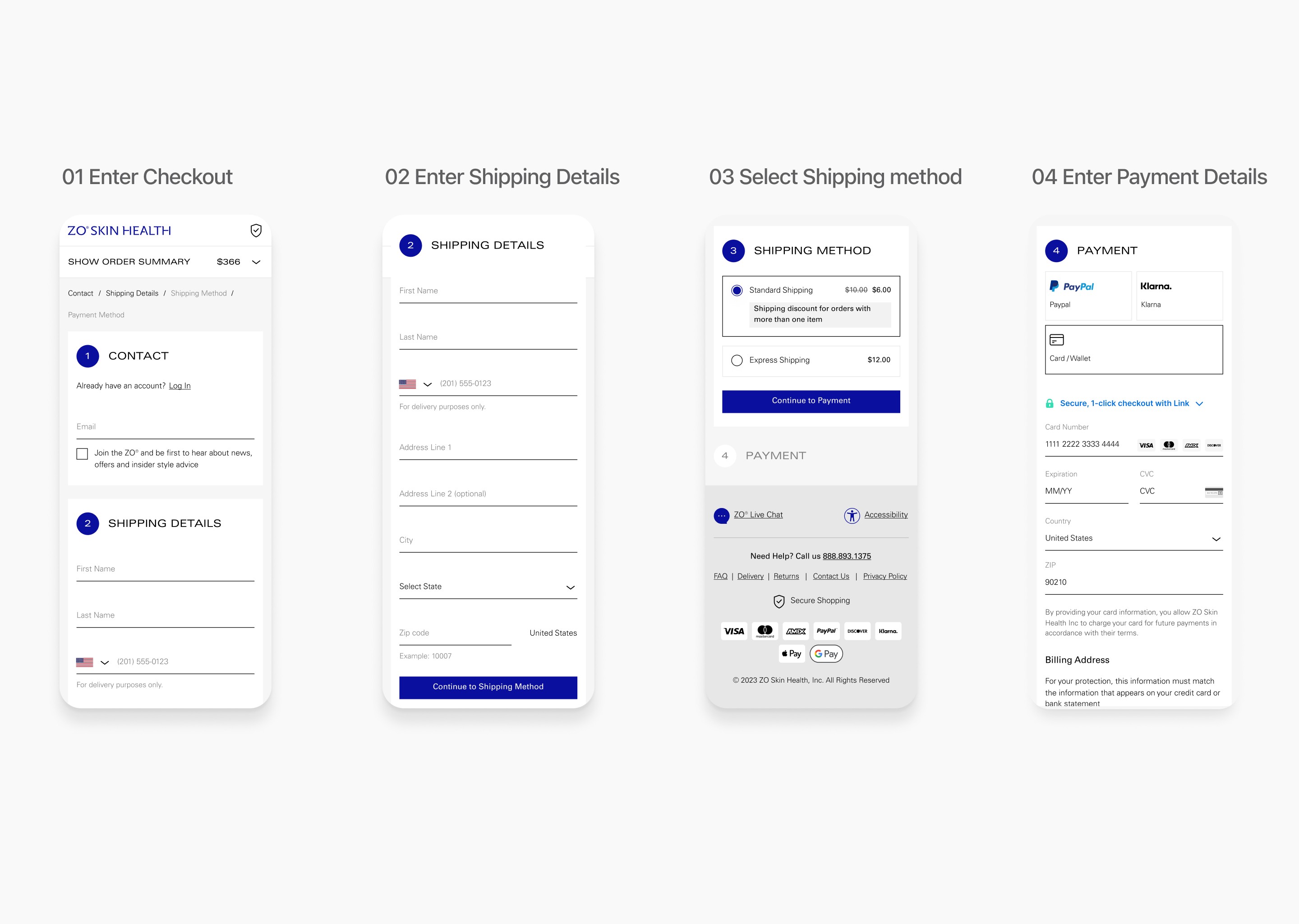
As mobile users account for the majority of ZO’s traffic, we prioritized a deep-dive into the mobile-first checkout experience. We mapped the complete end-to-end journey to identify exactly where the small-screen experience collapsed.
Problem for Merchants
High interaction cost
The multi-step architecture increases the mental effort required to finish a purchase. When the checkout feels "heavy" or repetitive, consumers lose momentum and are less likely to take action, leading to lost sales.
Lack of price transparency
Shipping fees are hidden until the final stages, causing "sticker shock" at the end. Reassuring consumers with costs earlier in the journey builds the trust needed for them to add payment details.
Low checkout reassurance
Consumers lack validation throughout the process, creating a confidence gap. Without consistent confirmation cues, users feel uncertain about their order, which prevents them from reaching the final "place order" step.
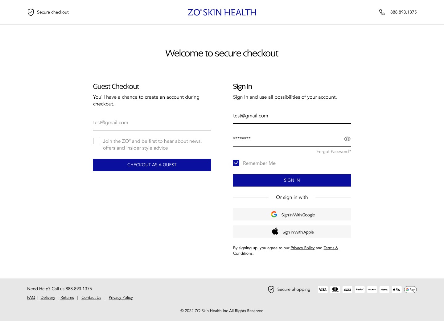
Solution
Design for purchase confidence
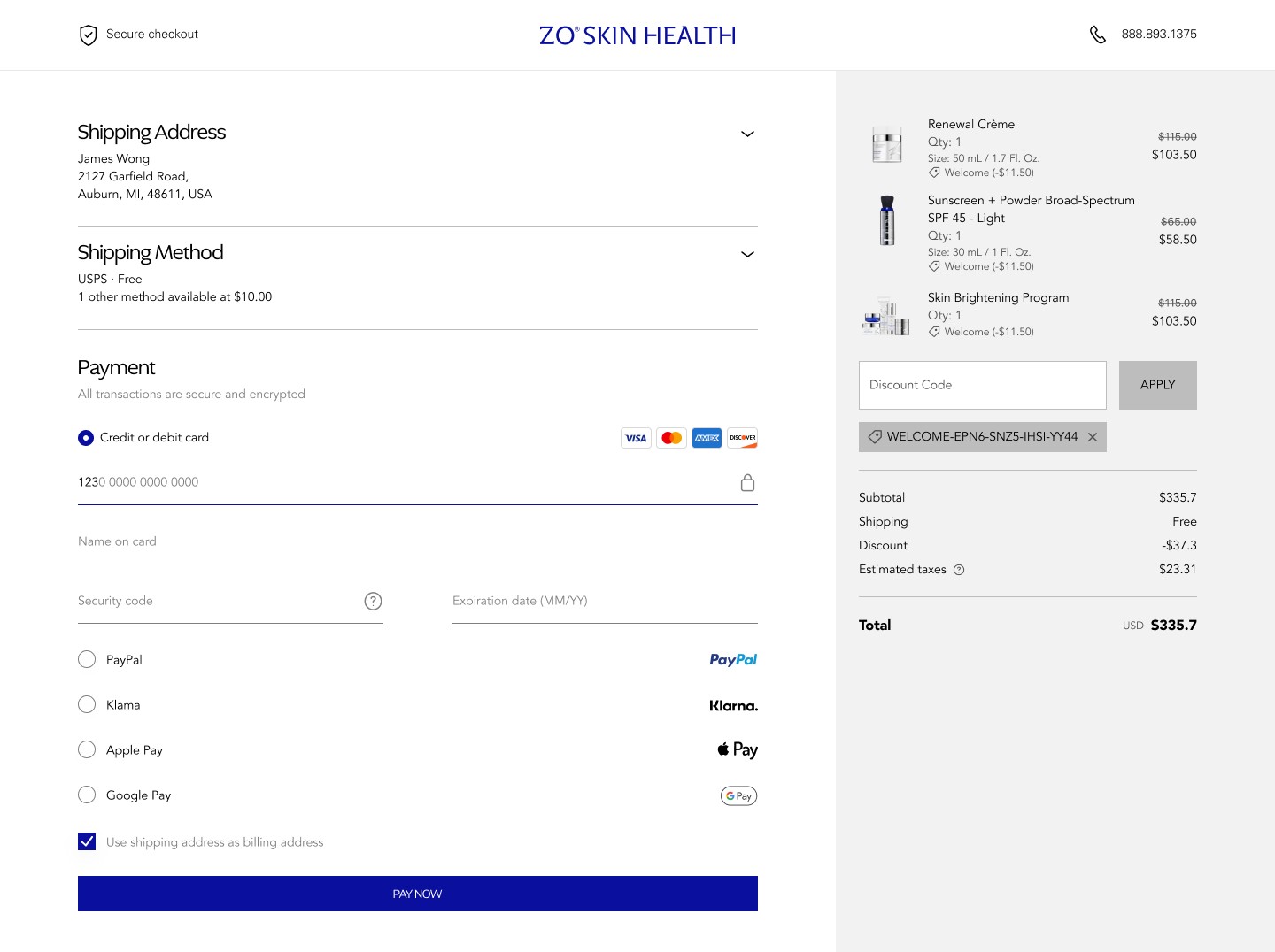
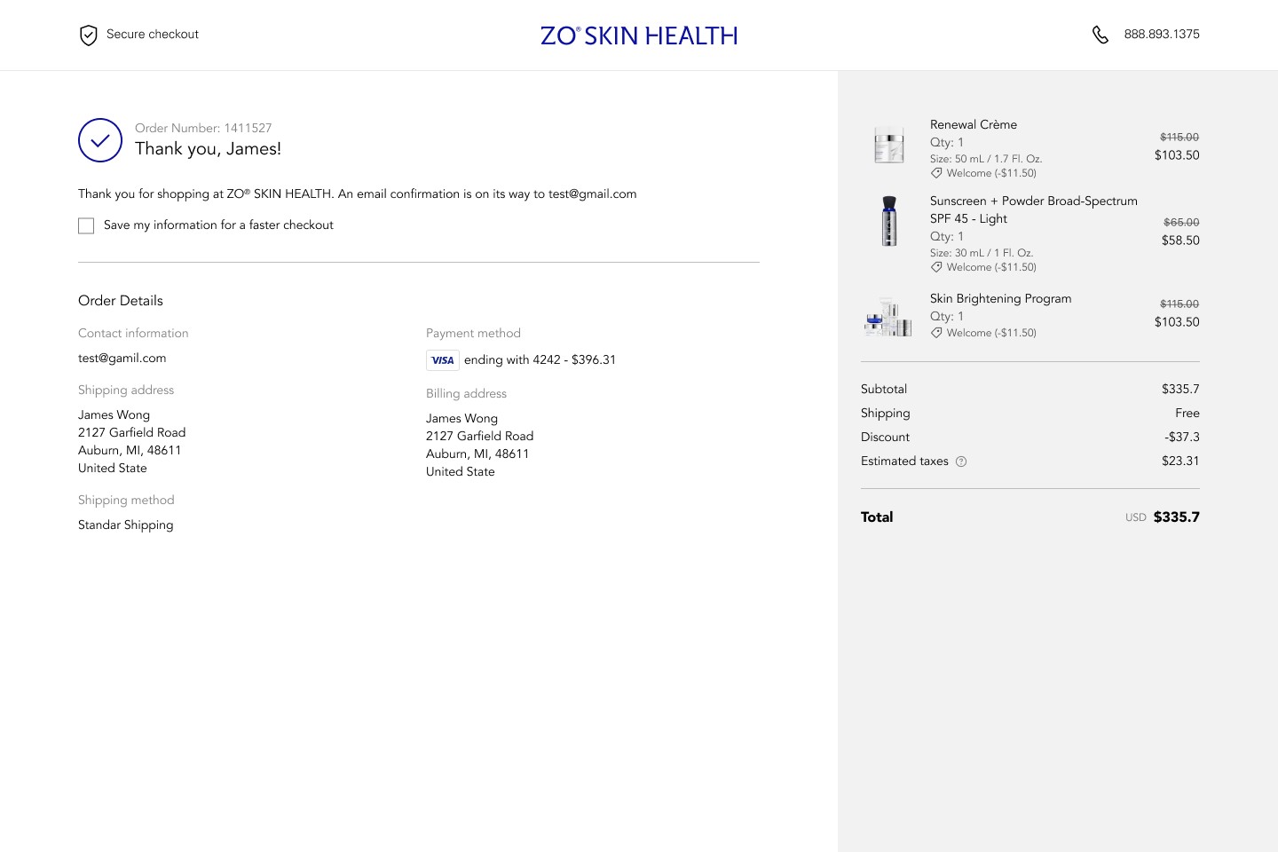
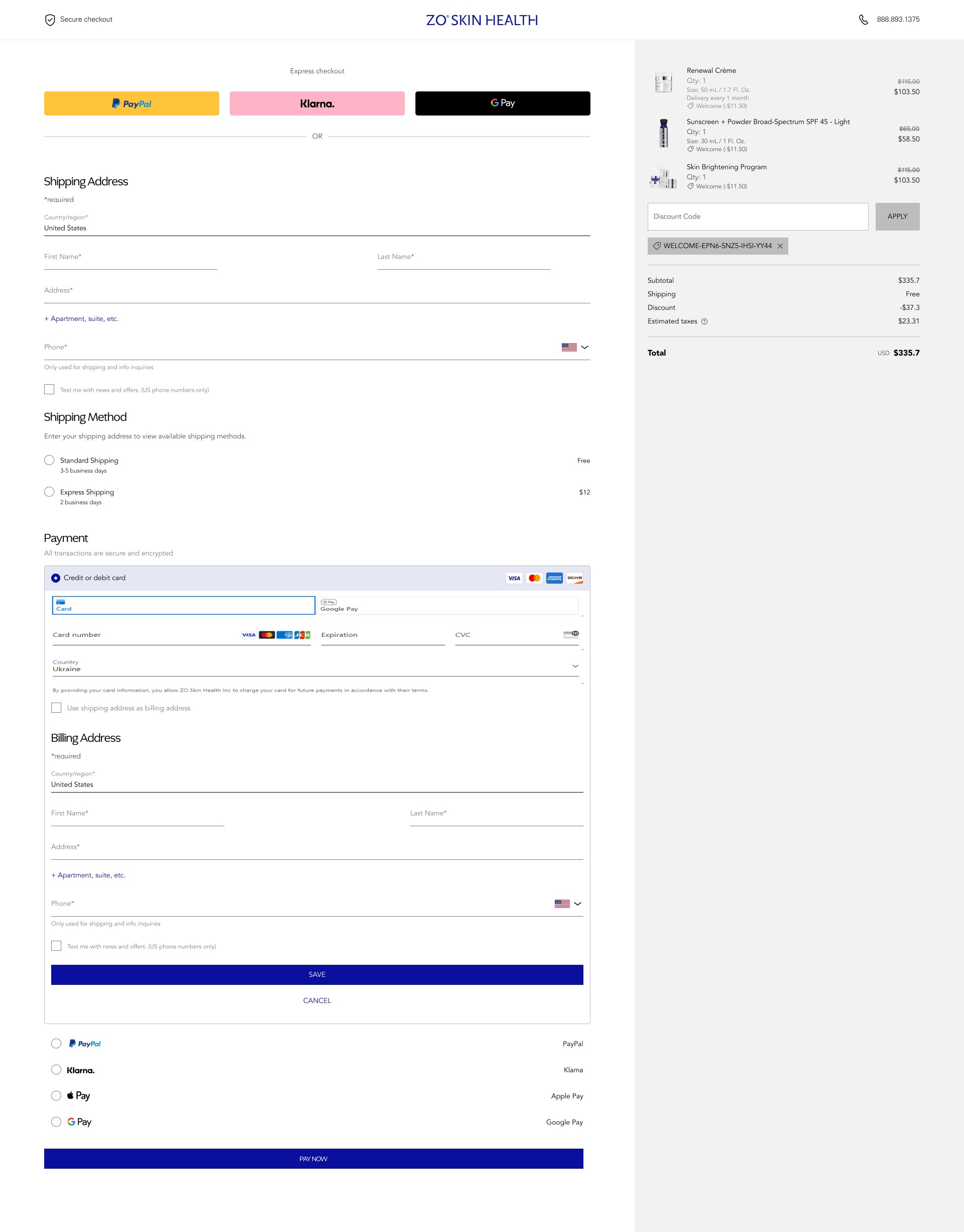
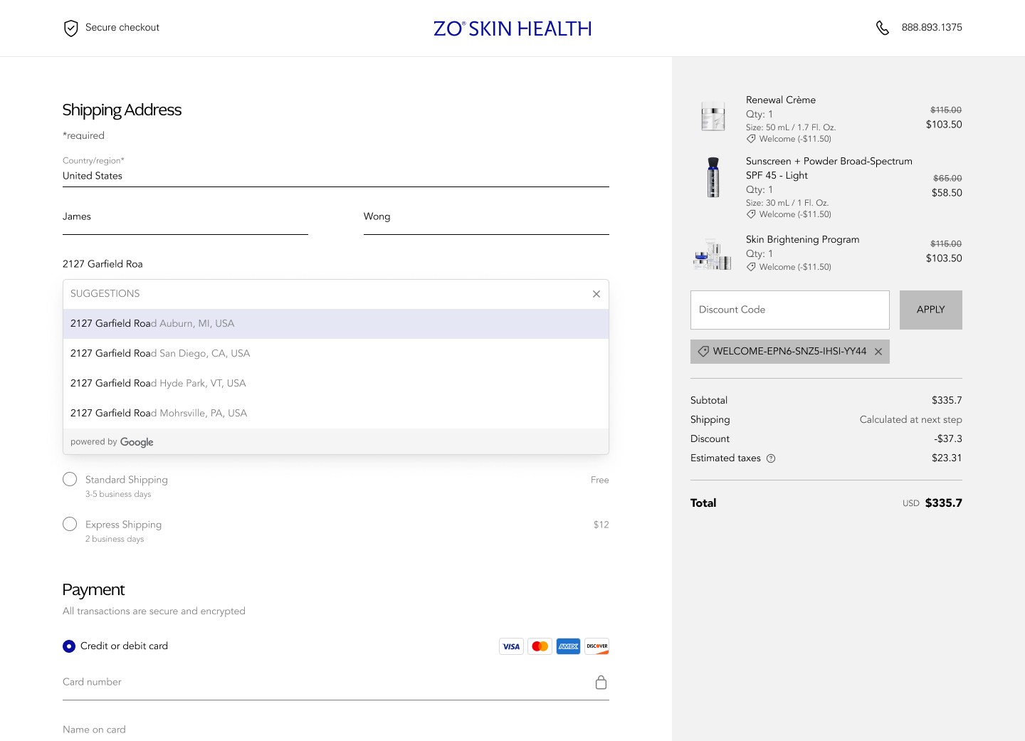
Design change 1: Add an Order Summary at the top of the checkout flow
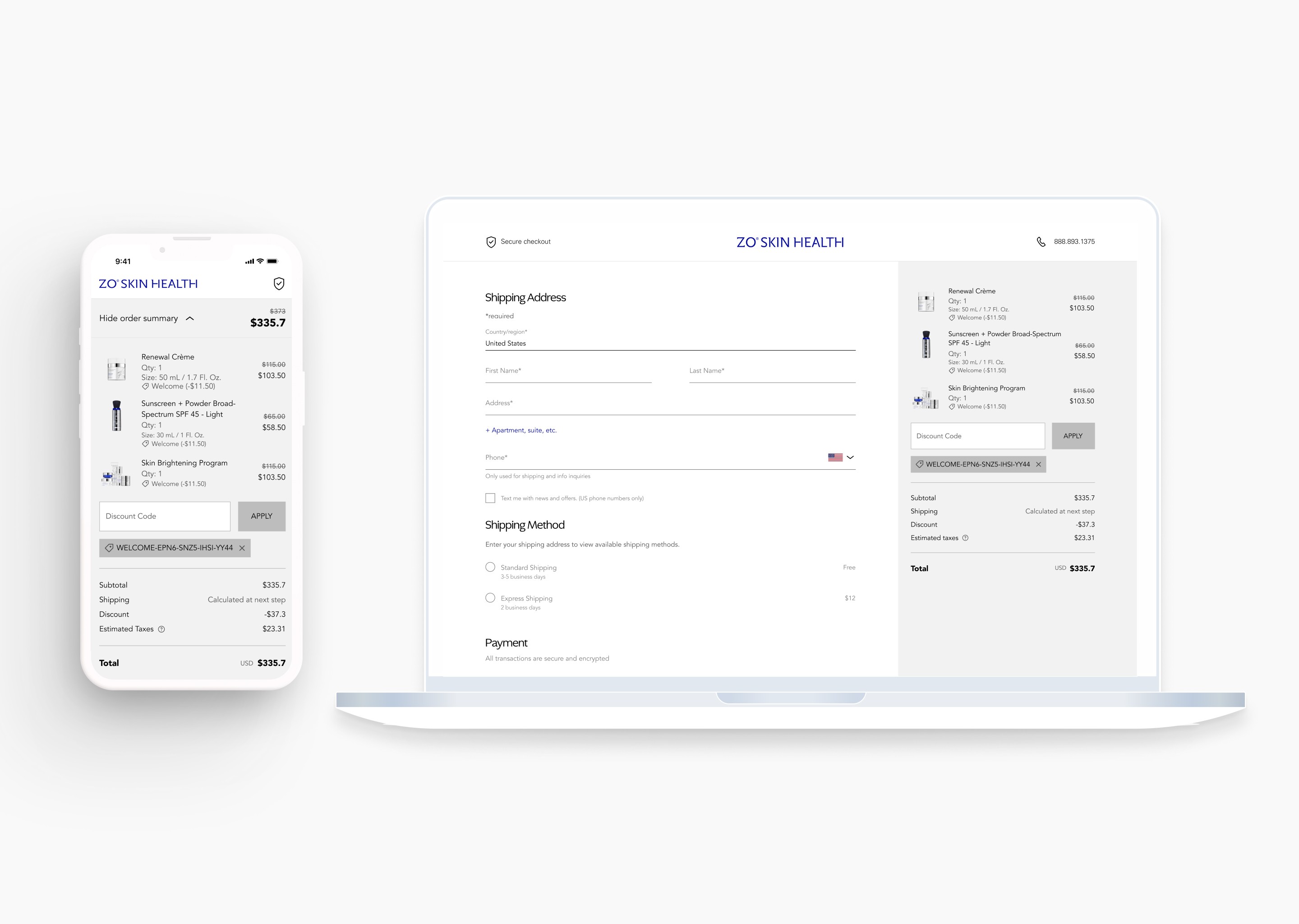
Description: An expandable order summary is placed at the top of the page, allowing users to view their item details, quantities, and prices without leaving the checkout flow.
Rationale: Providing a persistent view of order details reduces the mental complexity of the process. When users can easily verify their cart, they are more likely to take action and move to the next step.
Design for reduced interaction cost
Design change 2: Automate shipping selection based on address input
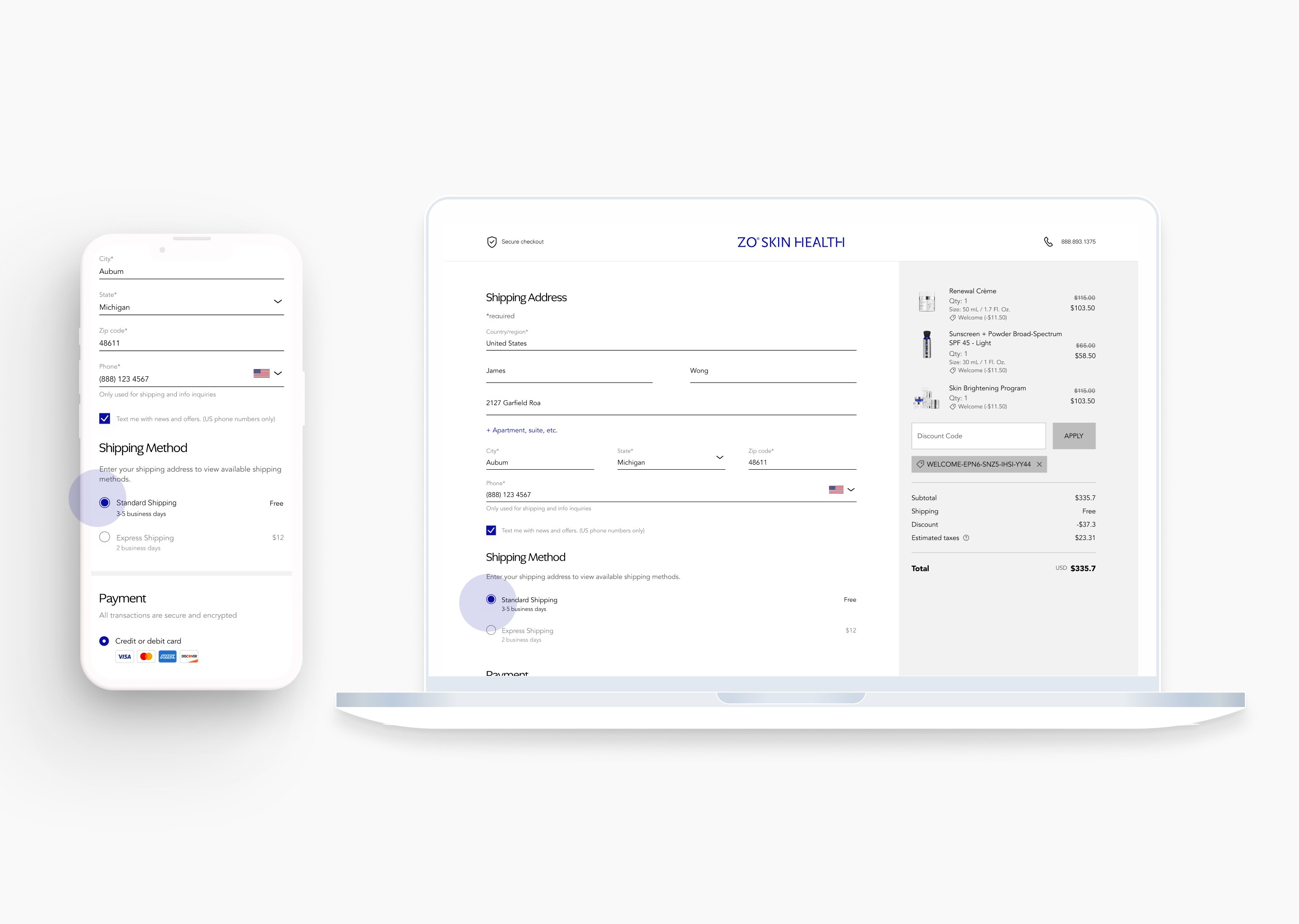
Description: Once the address is provided, the system auto-selects the first shipping option. This removes the need for a manual click before the payment phase.
Rationale: Automating this step minimizes clicks and reduces "mental stress." Eliminating unnecessary decisions maintains user momentum and lowers cognitive load for a seamless transition to payment.
Design for streamlined task completion
Design change 3: Implement contextual collapse for completed sections
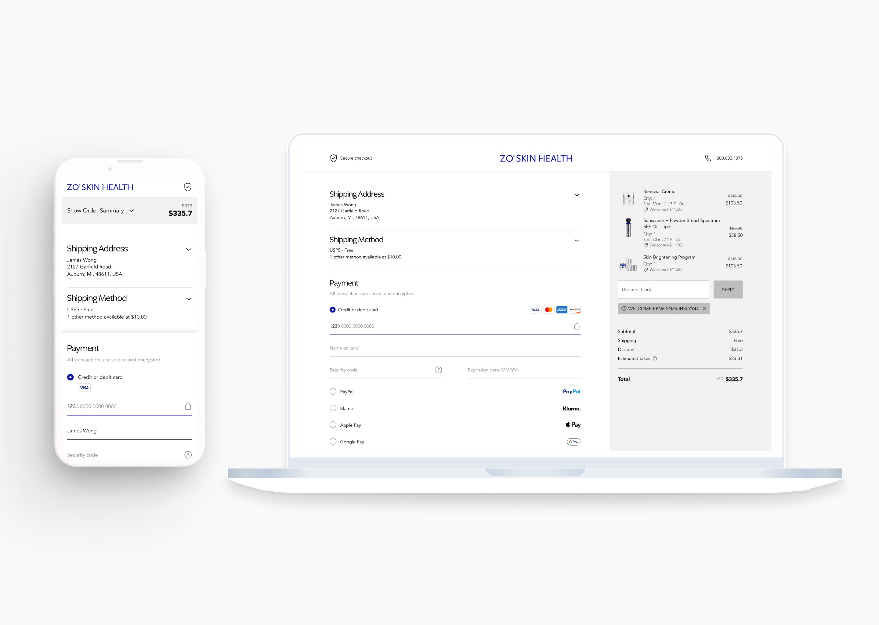
Description: When a user interacts with the payment section, the "Shipping Address" and "Method" fields automatically collapse into a summary view. This keeps the focus entirely on the active task.
Rationale: Automating this collapse reduces visual noise and the "mental weight" of the page. Utilizing progressive disclosure guides the consumer to the final action, minimizing interaction cost and increasing the likelihood of order completion.
Challenge - Technical constraints vs. Design integrity
Question: How do we integrate a third-party payment component without breaking the user’s momentum?
While the initial design used custom fields for a seamless look, technical and security requirements mandated the use of Stripe Elements. This created a conflict: Stripe’s fixed iframe structure didn't naturally support my "auto-collapsing" logic and custom styling.
The Pivot: Instead of fighting the constraint, I worked with the dev team to "skin" the surrounding container. We compromised by keeping Stripe’s secure input fields but wrapping them in our custom accordion logic.
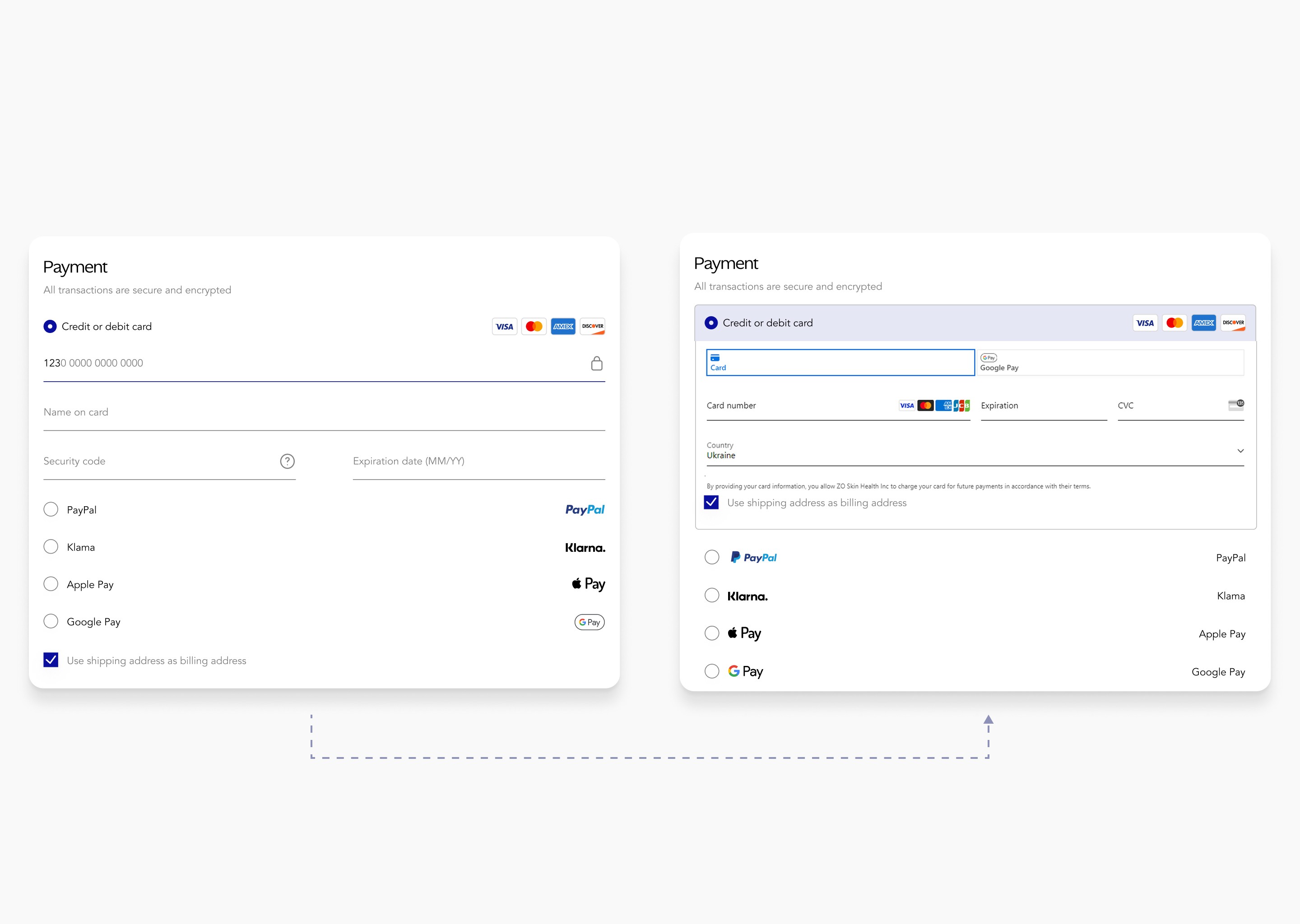
The Result: We met high-level security standards while maintaining the streamlined flow. This proved that the "perfect" UI is less important than a functional, secure, and trustworthy checkout experience.