Architecting a High-Conversion Diagnostic Regimen Finder
Solving conversion friction and vendor dependency through a tailored, in-house UX architecture

ROLE
Lead Product Designer
TIMELINE
01/2025 - 12/2025
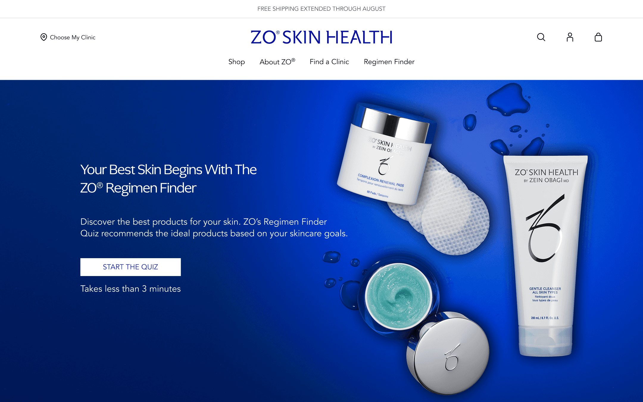
The Problem: Vendor Template Constraints Led to Funnel Drop-off
For years, ZO relied on third-party quiz templates that were static and boring. When users reached the results, they were met with a $300 price tag and a long 'grocery list' of products they didn't understand.
The result? People were overwhelmed and skeptical. Our analytics showed a 65% drop-off rate at the finish line because users didn't trust the recommendation. They didn't see the 'why' behind the science.
My Role
As the Lead Product Designer, I directed the end-to-end design from early 2025 through the global launch at the end of the year. I managed the project timeline and worked daily with a PM and 5 engineers to ensure the integrity of our headless architecture, while personally securing buy-in from the ZO Board by presenting the UX strategy. I also spearheaded clinical and analytics alignment, partnering with dermatologists to translate medical protocols and defining the funnel tagging strategy to pinpoint drop-off points.
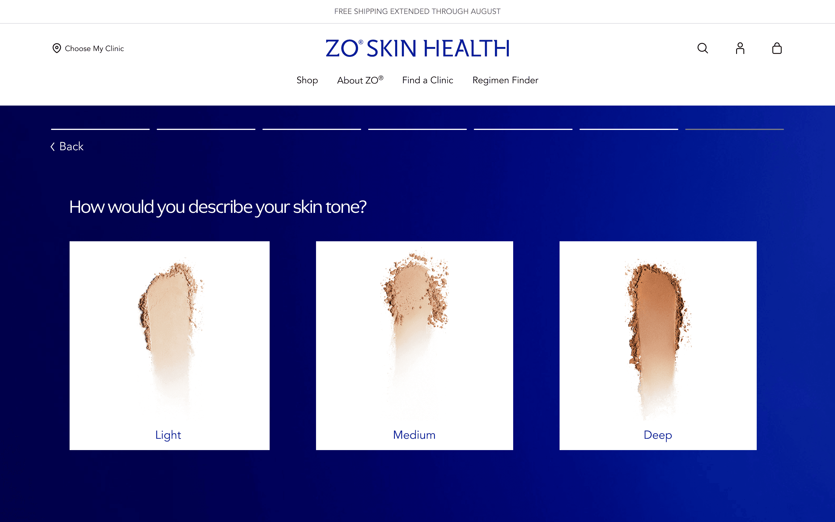
Question 1: How could we bridge the "Trust Gap"?
Our analytics revealed a 65% drop-off rate at the Results page, with users spending an average of only 12 seconds before exiting. Qualitative feedback confirmed that users felt "skeptical" and "overwhelmed." They weren't just rejecting the price; they were rejecting the "black box"—they didn't understand why these specific products were chosen or how to use them.
To move the user from Skepticism to Confidence, I redesigned the results experience based on two pillars of Trust Architecture:
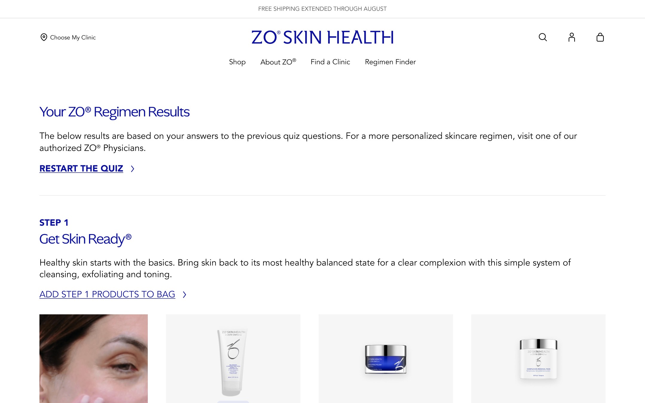
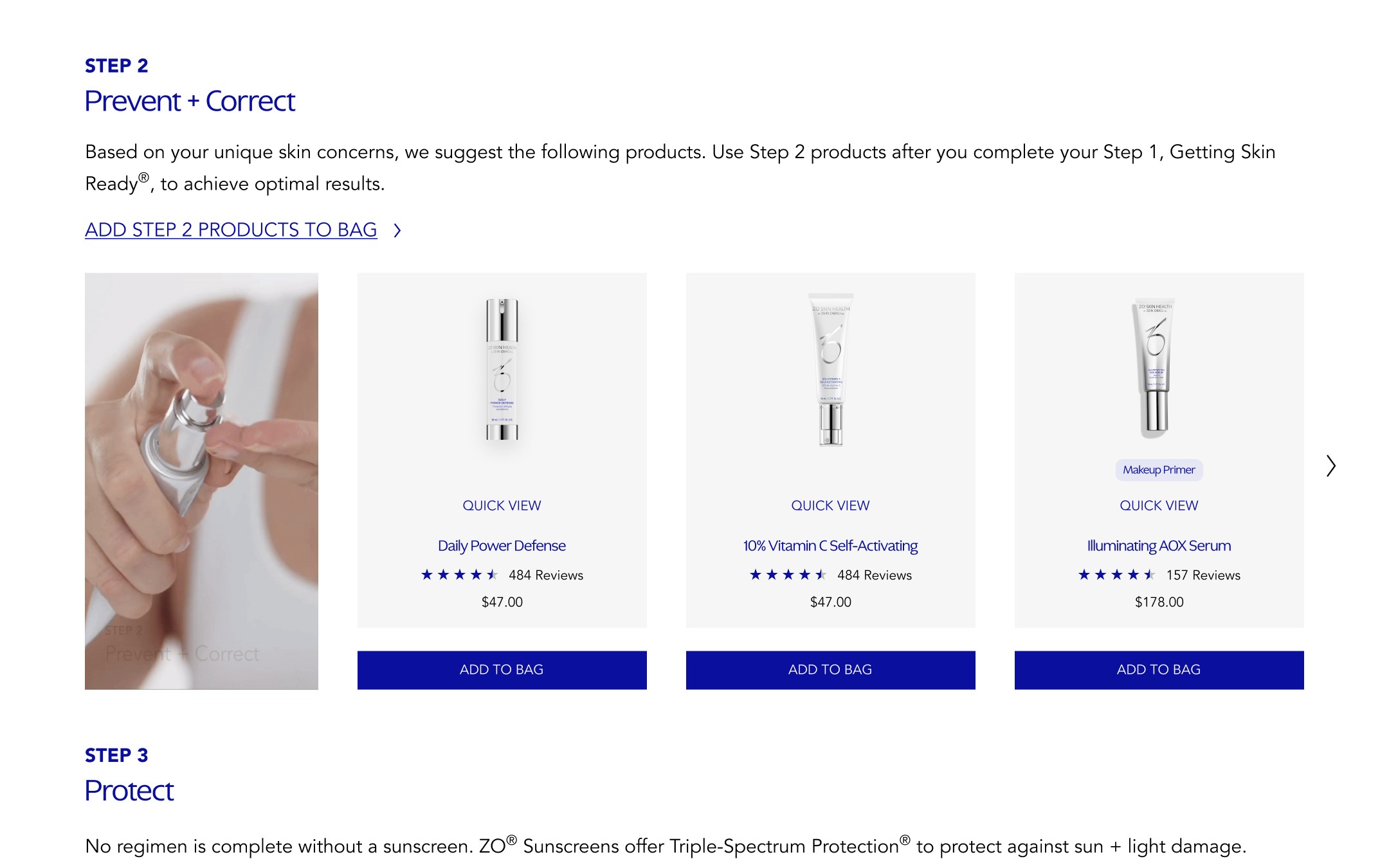
Structural Trust (The Ritual): I replaced the "grocery list" of products with a 3-Step Clinical Ritual (GSR, Prevent + Correct, Protect). This mirrored the authority of an in-office dermatologist visit, turning a daunting purchase into a structured investment.
Visual Trust (The Tangibility): I introduced high-fidelity looping GIFs of product textures. Seeing the viscosity and movement of the medical-grade formulas made the digital products feel tangible and "real," providing sensory reassurance before checkout.
Question 2: How can we make complex product recommendations feel more intuitive on mobile?
While the desktop experience allowed for a clear view of the regimen, the mobile version felt static and required a lot of vertical scrolling. Users were losing context between their specific skin concerns and the recommended solutions, which led to lower engagement compared to our desktop users.
The approach: Tactile interactions over static lists
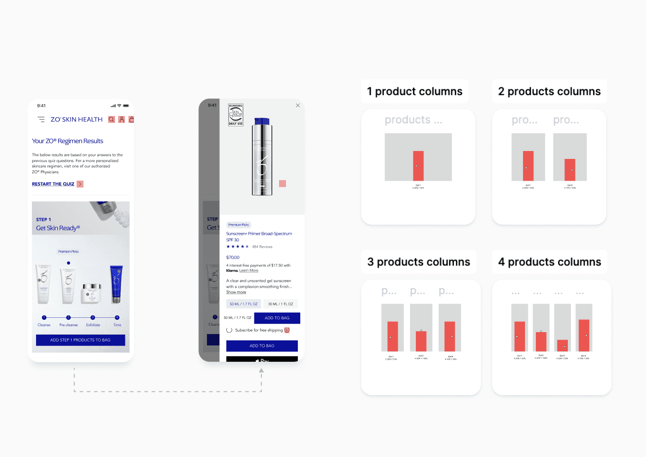
To solve this, I looked for ways to make the results page feel more interactive and "forgivable" for users exploring their options. I focused on a visual "Tag Point" system that allowed users to engage with the recommendations directly on a face-map.
Interactive "hotspots": I designed clickable "hotspots" on the product card. Instead of scrolling through a long list, users could simply tap an area—to see exactly which product was recommended.
Responsive Logic: Working with the engineering team, we moved away from pixel-based tags to a relative coordinate system (%). This ensured that no matter the screen size, the "Eye Cream" tag stayed perfectly pinned to the eye area without drifting or overlapping other UI elements.
The Logic
We wanted to reduce the "mental leap" between a skin problem and a product solution. By making the UI tactile, we turned a passive reading experience into an active, personalized consultation. It gave users a sense of control and clarity that a static list just couldn't provide.
The Impact
This shift to a mobile-first, interactive model helped bridge the conversion gap between devices:
Engagement: We saw a 25% increase in mobile feature interaction.
Retention: This clarity contributed to a 13% lift in membership retention, as users felt more confident in their personalized routine over time.