Optimizing Checkout Flow: The $50M Checkout Overhaul
Driving a 17% revenue increase by reducing transaction friction and simplifying the path to purchase.

ROLE
Lead Product Designer
TIMELINE
January 2024 - August 2024
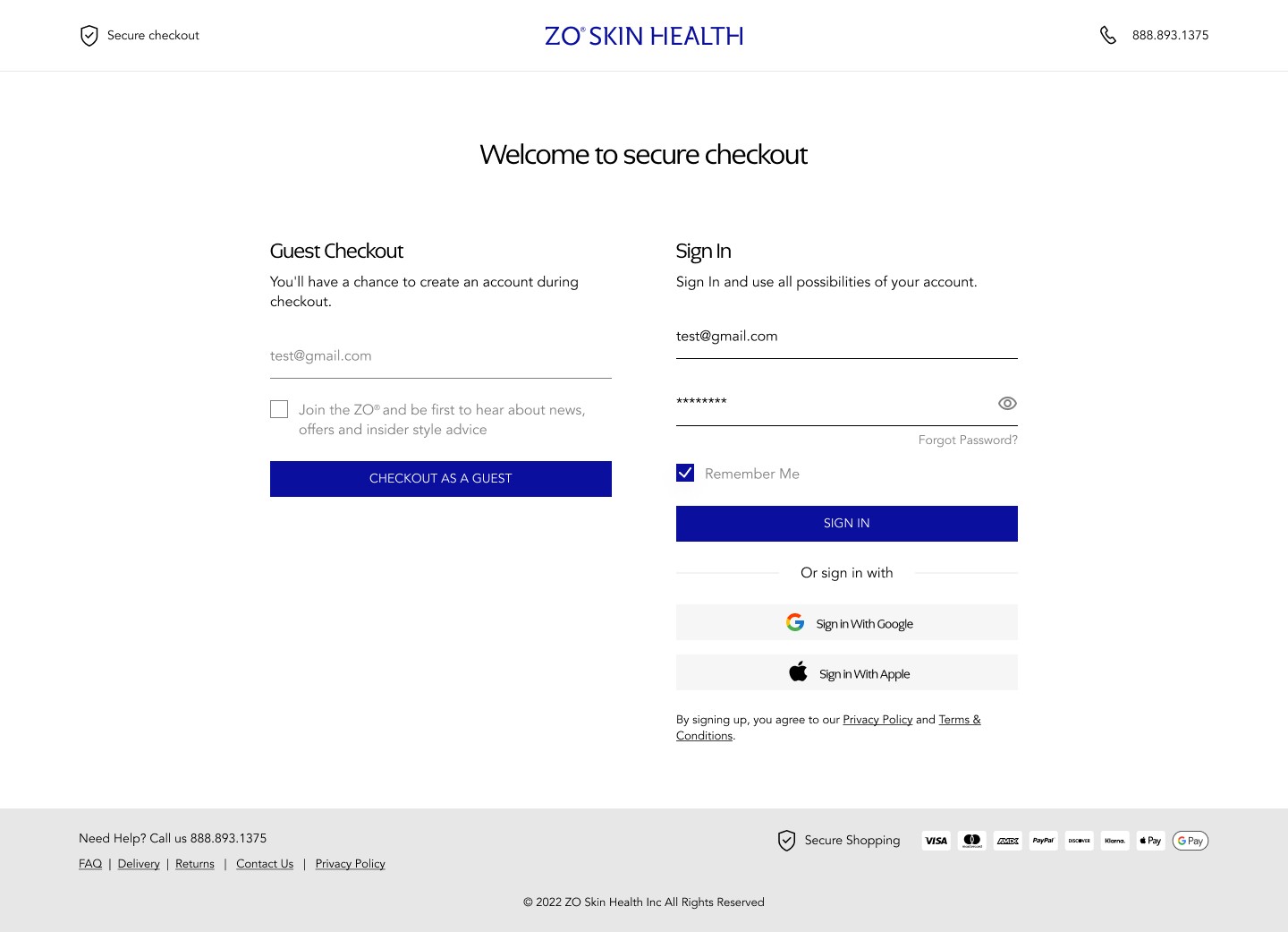
The Situation
ZO Skin Health is a high-end clicical skincare brand with a strong digital presence. In late 2023, the engineering team completed a platform migration from Shopify to Salesforce Commerce Cloud, a move driven by backend scalability needs as the business approached enterprise scale.
Within weeks of go-live, revenue dropped. Not slightly, noticeably.
Marketing spend hadn't changed. Brand positioning hadn't changed. Traffic levels were holding. The problem was somewhere between "user arrives" and "user pays."
I was brought in as Lead Product Designer find out exactly where — and fix it.
My Role
I stepped in as the Product Design Lead to bridge the gap between our business goals and technical reality. I went into Google Analytics myself and compared the Salesforce checkout flow with historical Shoptify data, and dug into why. I worked daily with five engineers to navigate the constraints of Salesforce and Stripe.
Defining the Problem
My first instinct was to resist assumptions. Before I could design anything, I needed to understand the gap between what we expected users to do and what they were actually doing.
What the data showed:
I went to Google Analytics myself and ran a side-by-side funnel comparison between the legacy Shopify flow and the new Salesforce implementation. I mapped CTR and abandonment rates at every step in the checkout sequence.
The signal was clear: there was a catastrophic drop-off between the Shipping Info step and the Payment step — a cliff edge that simply did not exist in our Shopify baseline. Users were making it through product selection, cart, and shipping input... then leaving right before entering payment details.
That specific pattern told me a lot. It wasn't discovery friction or price sensitivity — users had already committed to buying. The failure was happening at the moment of highest intent. Something about the transition into the payment phase was breaking their confidence.
Mobile made it worse:
Mobile users account for the majority of ZO's traffic. When I mapped the complete mobile-first journey end to end, the collapse points became even more visible. The small-screen experience had inherited the structural logic of a desktop flow — multiple visible sections competing for attention on a 375px viewport, no clear sense of where the user was in the process, and no reassurance that the system was working correctly.
Three root causes emerged
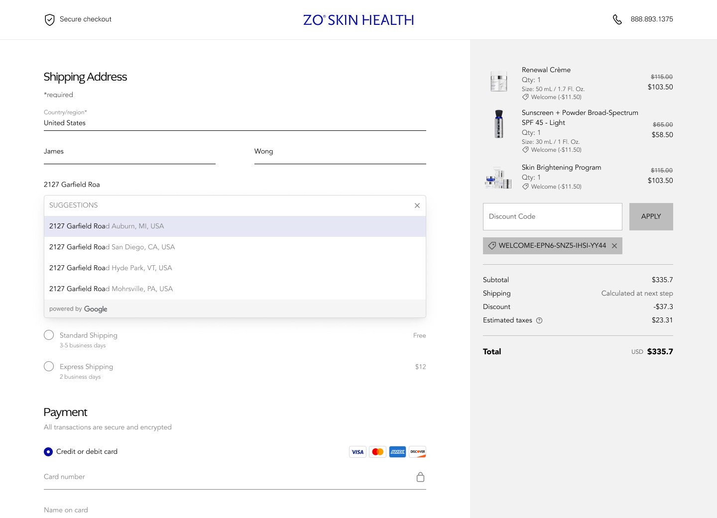
Hidden pricing until the end
Shipping costs weren't surfaced until the final step. For a premium skincare brand, the order total is a signal of quality — but when that number appears late with additions attached, it reads as a surprise. That surprise erodes trust precisely when trust matters most.
High interaction cost.
The multi-step architecture required users to make repeated decisions across disconnected screens. Each transition asked users to re-orient, re-read, and re-confirm. The cumulative mental weight was causing momentum to bleed out before the finish line.
No validation loop.
Users were completing actions — entering addresses, selecting options — with no clear confirmation that the system had registered what they did. Without feedback cues, the experience felt uncertain. Uncertain experiences don't convert.
Design Decisions
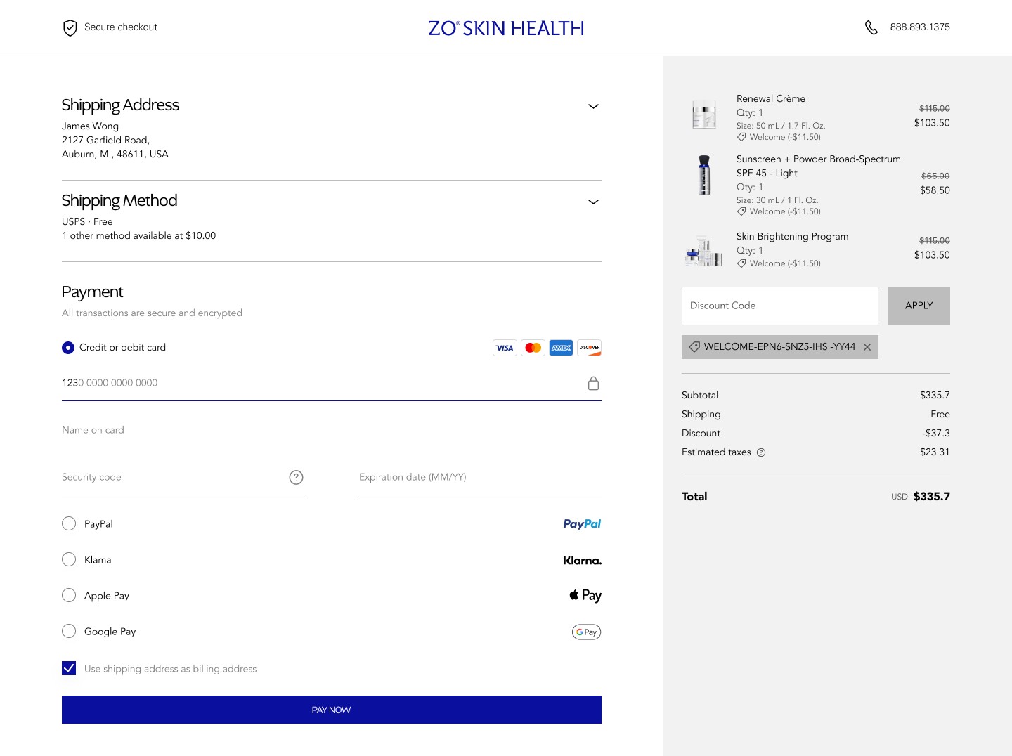
Decision 1: Persistent Order Summary at the Top of Flow
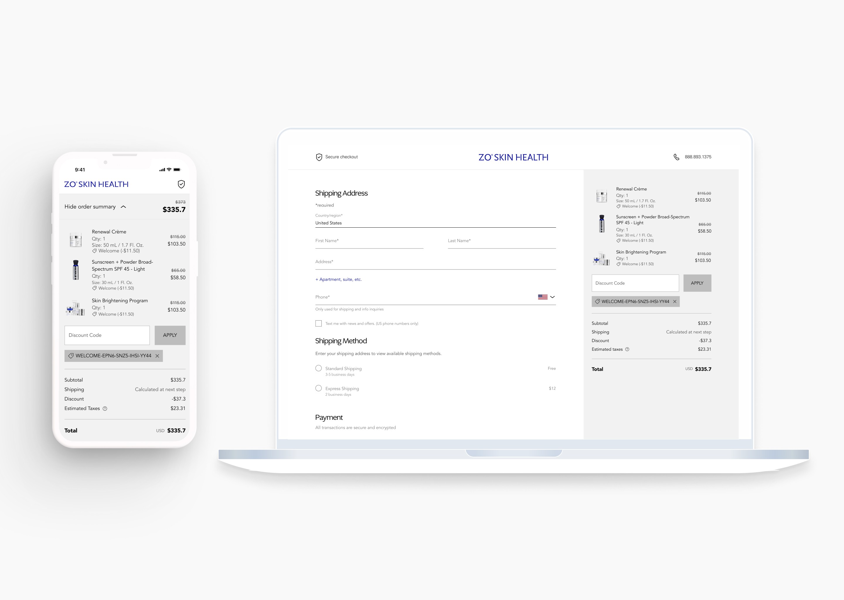
The change: An expandable order summary panel, anchored at the top of the checkout interface, displays item details, quantities, and pricing at every step — without requiring the user to leave the flow or scroll to find it.
Why this worked: Users who can see what they're buying stay grounded in the transaction. The cart is their anchor. When it's hidden, users feel like they're filling out a form in the abstract — disconnected from the thing they actually want. Bringing the summary into persistent view is a subtle but powerful signal: you're in control, we haven't lost your cart.
It also addressed the price transparency problem. Instead of revealing the full order total at the end, users could see it updating in context. No surprises.
Decision 2: Auto-Select Logic Triggered by Address Input
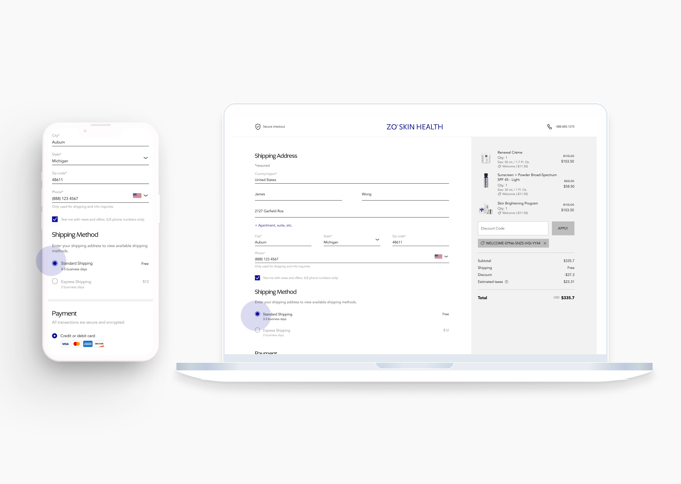
The change: Once a user completes their shipping address, the system automatically selects the first (and most common) shipping option. No manual click required before proceeding to payment.
Why this worked: Between Shipping Info and Payment, we had inserted an invisible tax: make a choice before you can continue. For most users, that choice was trivial — they would have clicked the default anyway. But the cognitive friction of a required decision, even a simple one, creates a pause. Pauses leak momentum.
Removing that click eliminated one full decision-making step. It sounds minor. In a checkout funnel under cognitive load on mobile, it's not minor.
Decision 3: Contextual Collapse (Progressive Disclosure)
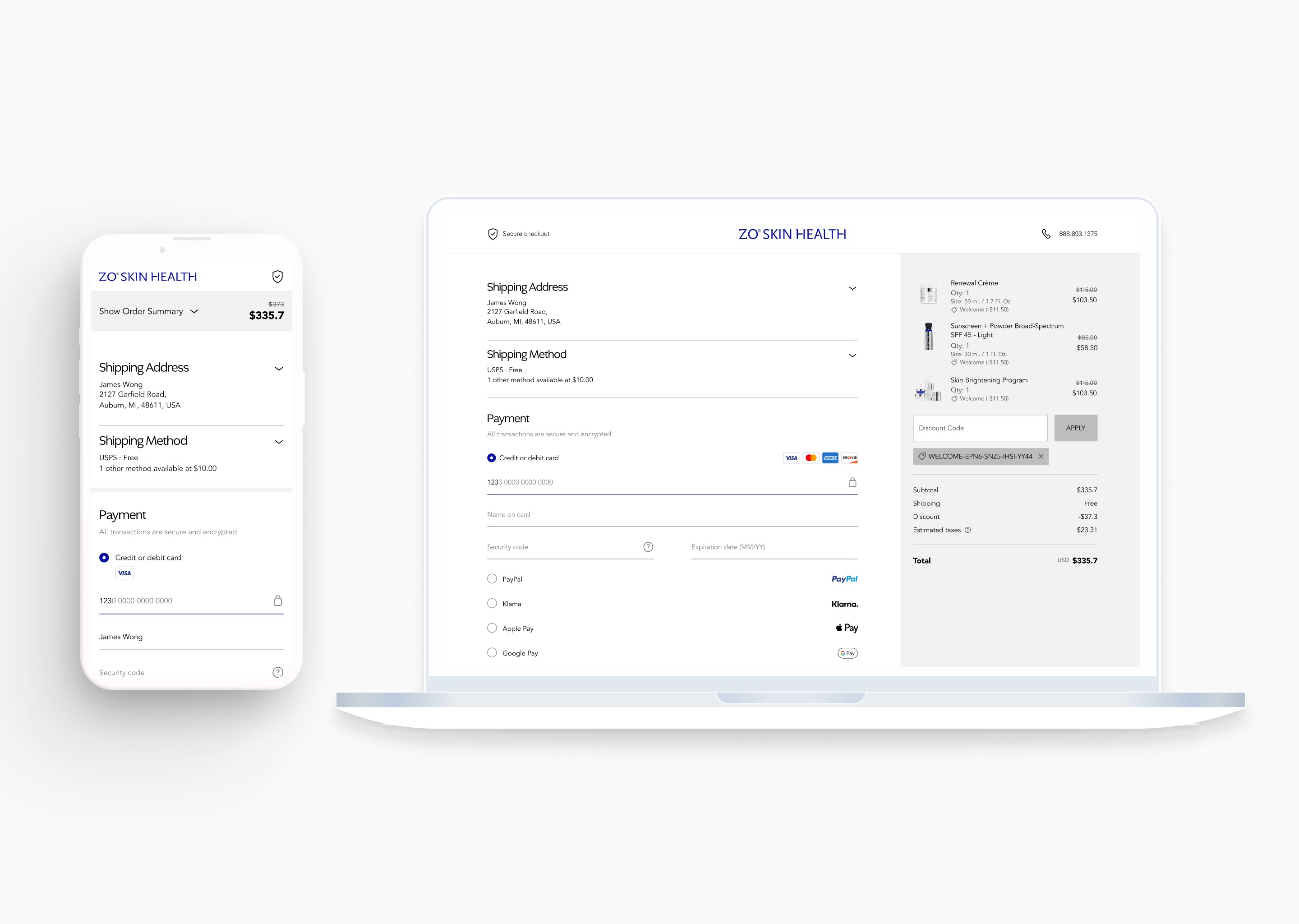
The change: When a user enters the Payment phase, the Shipping Address and Shipping Method sections automatically collapse into compact summary views. The full interface attention narrows to the one remaining task.
Why this worked: Checkout is a sequence of commitments. Once a commitment is made — address entered, shipping selected — it shouldn't keep demanding visual space. Collapsing completed sections serves two purposes simultaneously: it confirms to the user that their input was accepted, and it focuses all remaining cognitive energy on the final step.
This is especially important on mobile, where every pixel competes. A collapsed summary that says "123 Main St — Standard Shipping" is far less demanding than an open form the user has to scan, ignore, and scroll past.
The Hardest Problem: When the Technical Constraint Becomes a Design Problem
About midway through the project, we hit a wall.
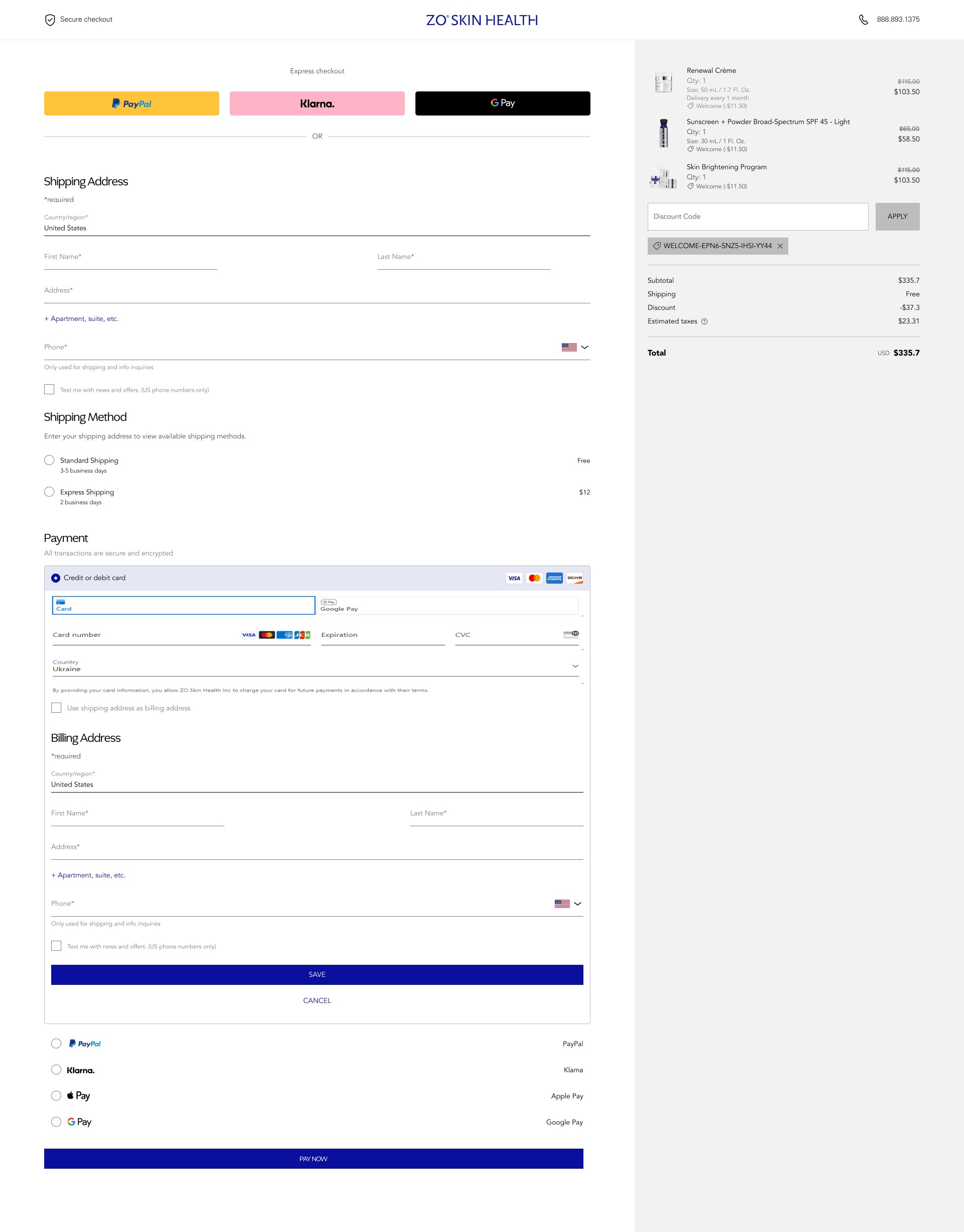
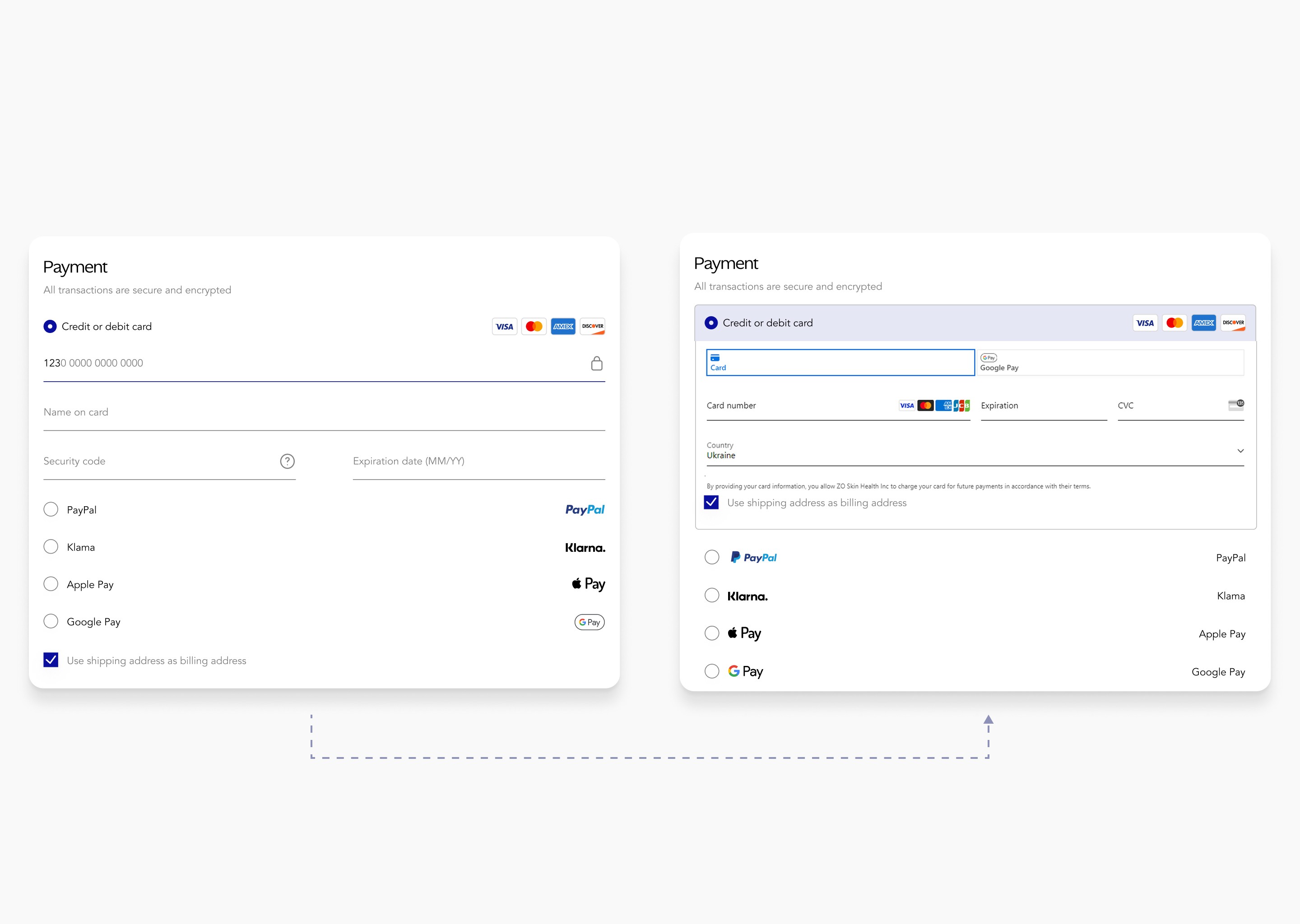
To support the Salesforce migration, the team had integrated Stripe Elements for payment processing. Stripe's architecture uses secure iframes for its input fields — an intentional security measure that prevents external scripts from accessing sensitive financial data. That's correct behavior. But it created a conflict with our custom UI logic.
Our accordion collapse system — the contextual progressive disclosure pattern described above — used JavaScript event listeners to detect user interaction and trigger section animations. Stripe's secure iframe blocked the event propagation our logic depended on. The animation would trigger incorrectly or not at all. For a moment, it looked like we might have to abandon the entire interaction model.
The decision I made:
I reframed the problem. Instead of treating the Stripe constraint as an obstacle to our design, I started asking: what does Stripe actually need to stay intact, and what can we build around it?
Working daily with the engineering team, we built custom wrapper components around Stripe's secure containers. The payment input fields themselves were untouched — Stripe's security handshake remained completely intact. But the surrounding UI — the section header, the collapse trigger, the visual affordances — was rebuilt to work with the iframe boundary rather than against it.
We also made a deliberate trade-off: we deprioritized custom animation fidelity in favor of checkout stability. If a design choice risked the integrity of the Salesforce–Stripe security layer, we chose the stable path. Every time.
Why this matters beyond the solution itself:
This decision established a working principle for the project: for high-transaction, high-trust products, functional security is the highest form of UX. A broken payment experience is not a UX failure. It's a business failure. A slightly less animated transition that processes payment reliably is worth infinitely more than a beautiful transition that introduces any doubt.
The Result: This trade-off proved that for a high-scale transactional system, functional security is the highest form of UX. By embracing the technical constraint rather than working against it, we maintained a 100% secure checkout without sacrificing the streamlined momentum of the user journey.
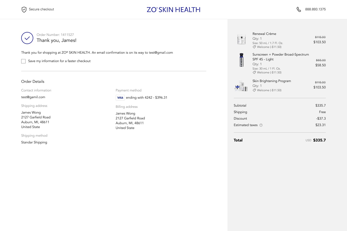
Results
The redesigned checkout shipped to 100% of ZO Skin Health's user base in August 2024.
Metric | Outcome |
|---|---|
Revenue increase | +17% |
Support tickets related to checkout | −82% |
Rollout coverage | 100% |
The 17% revenue increase, measured against the post-migration baseline, translated to a recovery — and growth — that brought digital revenue to $50M for the platform. The 82% reduction in support tickets was an unexpected secondary outcome: when users stopped getting confused in the checkout flow, they stopped contacting support about incomplete orders.
What I Learned
Data narrows the problem space. Judgment still closes it.
The analytics told us where users were leaving. They didn't tell us why trust was breaking down, or why the mobile experience felt heavy, or why users were abandoning right at the payment step specifically. Those answers came from sitting with the user journey, reading it as a sequence of emotional states, not just a conversion funnel.
Working with constraints is a design skill.
The Stripe conflict forced me to think about what was actually essential versus what was preference. Custom animations were preference. Payment security was essential. Once I was clear on that hierarchy, the solution became obvious. Constraints often make the design better by forcing that clarity.