Campaign Intelligence System
Rex Black's content team was manually juggling LinkedIn posts, newsletters, and articles across disconnected tools, losing context and duplicating work. Built a unified Campaign Intelligence System that consolidated everything into one workflow.
Rex Black's content team was drowning in manual work — switching between tools, re-entering data, and losing track of campaigns across LinkedIn, newsletters, and articles. Built a Campaign Intelligence System that unified all publishing into a single workflow, cutting campaign setup time from 2 hours to 15 minutes and giving the team real-time visibility across all channels for the first time.

ROLE
Founding Designer
TIMELINE
April 2026 - Present
The Problem
We had no way to promote ourselves at scale
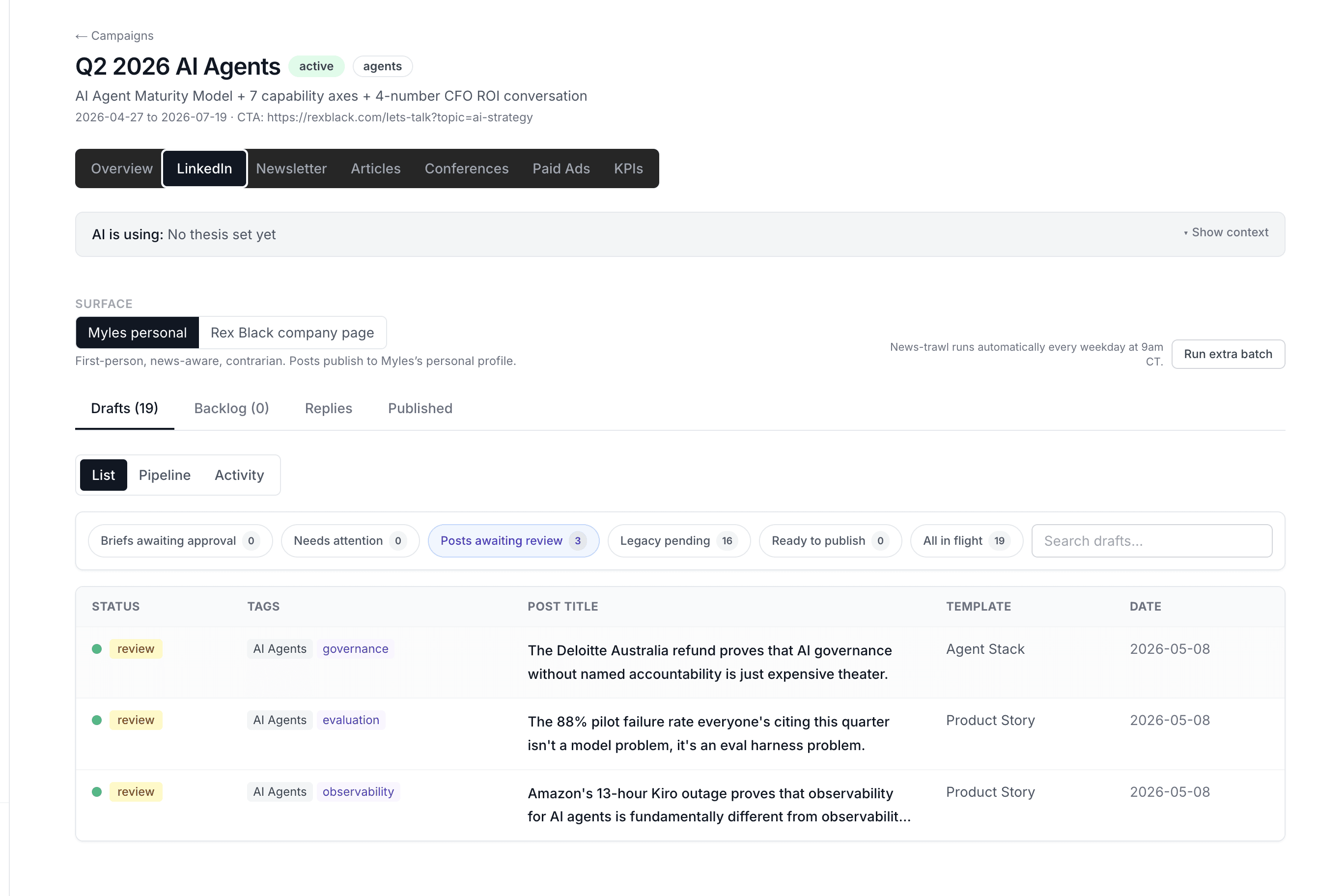
Posting manually on LinkedIn takes time and leaves no trail. No way to track what's working, no way to connect content performance back to actual clients and deals. We needed a real pipeline, not just a place to write posts.
The decision was to build it inside our own CRM. That way, everything stays connected: content, contacts, and campaign performance in one place.
My Role
I owned this end to end — no PM, no separate engineering handoff
The way this project worked was different from a typical design process. Instead of designing in Figma and handing off to a developer, I was designing and building at the same time — making interaction decisions directly in code, shipping fast, and adjusting based on what actually worked.
That meant every decision had to be deliberate. There was no review cycle to catch mistakes later.
Design Decisions
The review interface went through three states before it worked
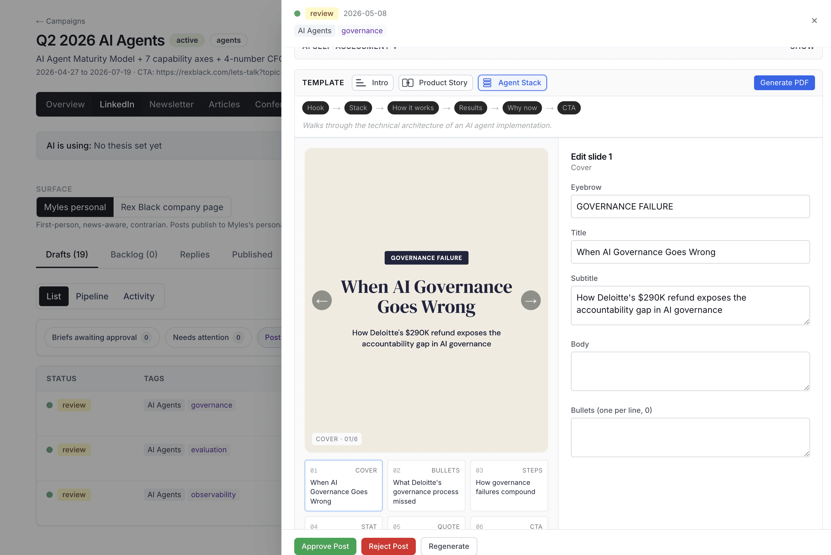
The first version was a single long page — all posts stacked vertically. Scrolling through 9 drafts to review and edit them was slow and disorienting. Easy to lose your place.

The fix was a split view: list on the left, full post preview and edit on the right. Click a row, see everything. No page navigation, no losing context.
The carousel editor lives in the same panel — slide thumbnails across the bottom, edit fields on the right, live preview updating as you type. The goal was to make review feel like reading, not form-filling.
The AI needed a way to show what it was doing
The system generates posts automatically, but handing content decisions to AI only works if you can see what it's doing and change it when you disagree.
I designed a Pipeline view with four levels, from fully manual to fully autonomous. Each post sits in a column based on how much trust has been established. You can move it. You can pull it back.
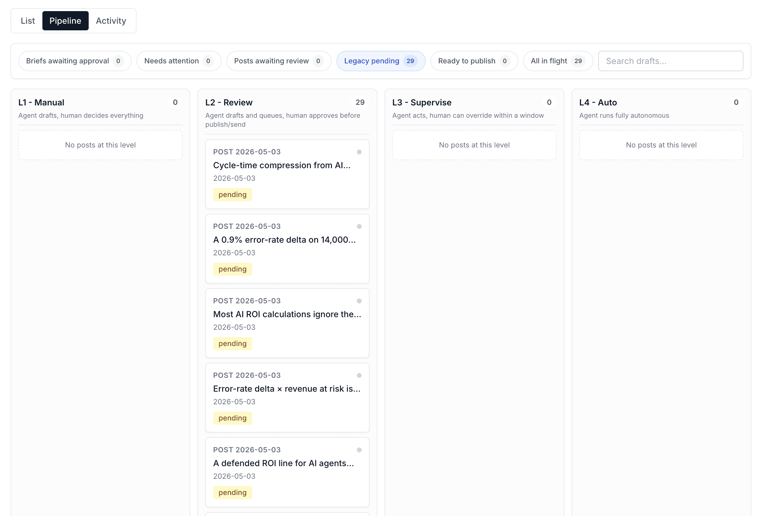
There's also an Activity view that logs every decision the agent made, when it acted, when it flagged something for review, and why. The transparency is the safety net.
Campaign setup was too heavy for a first step
The original campaign creation flow asked for everything upfront — name, audience, strategy, KPIs. Too much to think through at once. People would either fill it in carelessly or not start at all.
I split it into two steps. Step one: just the basics, get the campaign created. Step two: strategy and KPIs, which you can come back and fill in later. Auto-save throughout. The goal was to make starting easy, not perfect.
Results
Rex Black now has a content pipeline it didn't have before — LinkedIn posts, newsletter, and articles all running in one system. The agent generates drafts daily, review takes about 10 minutes, and everything connects back to contacts in the CRM.
It's a 0-to-1 project. The measure of success right now is that it's running.
What‘s Next
The templates work, but the content still feels generated.
Too few options and every post sounds the same. Too many and users don't know where to start. The next problem is giving the agent enough range to produce content that actually sounds like Owner, without turning template selection into a decision the owner has to make every time.